Wednesday, 30 December 2015

Organisation: props


Here I have looked into Mise-en-scene and into what props would be appropriate to the theme of pop. Overall I would like to use these props or similar ones in my front cover magazine because I believe it will look good with my cover star and house colours used. 


Here I have looked into bubblegum as it is something that I believe my main cover star could use to represent pop music. I could imagine my cover star standing there with a large bubble looking right into the camera creating  relationship between the audience and the star. I could also use the colour of the bubblegum to continue with the house colour and colour scheme of the magazine. I could use different colours of bubblegum to see which colour suites best to my background and house colours 

I have researched into head phones because I think it will go very well with my theme of pop, Alot of people use earphones including stars so therefore people can relate to them, this  could also all the audience to be interested and keen on the idea on earphones because f their idol is wearing them they might want to buy the same ones to be just like them. i also like the idea of the earphones because i can imagine my cover star with them in looking up or to the side, if i also link anther prop inot this i could also imagine the star looking to the left or right with earphones in with a big bubble from the colourful bubblegum.

I looked into a guitar because many artists such as Edd Sheeran, Taylor swift and Shawn Mendes. all these celebrities are recognised because they also play guitar. would like my audience to recognise and relate to the guitar and its purpose which stands for the love of music. I have looked into Edd Sheeran with a guitar and this is what my cover tar could possibly look like http://snoweasmedia.blogspot.co.uk/2015/10/research-into-similar-products_22.html  i have also looked at James Bay and there is an image of him which is also used which i like and is how i could imagine my cover star to look like: http://snoweasmedia.blogspot.co.uk/2015/11/research-into-similar-products_17.html . this is how I could see my pop stars to look and be presented with a guitar.

I like this prop because alot of pop artists use them and they are stylish. i could imagine my cover star artist wearing these whilst looking to the left or right. I could use the colour of this pair of sunglasses with the house colours and different colours that my star wears. this could bring attention to the magazine because they are well known and if the fan likes them they will want a pair just like them to be like the star therefore the magazine front cover is remembered.

This use of prop is widely and internationally used and recognised by its use. Pop artists use these props therefore if it is used in my front cover magazine it will represent the use of pure music and the love of music made. many things could be used with this prop because i could use the different props  of sunglasses or bubblegum. I would also like to use this prop because it looks professional  and it will look effective because it immediately grabs the readers attention because we want to know who this new celebrity star is.


Tuesday, 29 December 2015

organisation with photo shoot

I will experiment with effects shown here: http://snoweasmedia.blogspot.co.uk/2015/12/organisation-effects.html. I have looked into the weather and I have chosen a day which was convenient for both me and my model. i plan to take my photography in a forest location with also some graffiti like I said in a previous post. http://snoweasmedia.blogspot.co.uk/2015/12/organization.html therefore i am experimenting with location settings and plan to take various photographs of high quality images.

Saturday, 26 December 2015

organisation- potential clothes photo shoot

In my next blog post i will be showing you the types of clothing I would like my potential model to be wearing. I have chosen various clothes and took my own photography to allow a further understanding of what my model will look like and what type of clothes they could potentially wear. The clothes i have chosen very carefully because i want the theme of pop to come out. i understand that pop music in today's generation is listened by young teenagers therefore i would like my pop artist to look similar to a teenager with the ideas presented through clothing.

in my next blog there will be alot of photography of clothes. this is because although there is no model yet wearing them i would like to use the effect of black and white and different effects to see the difference and to also see if it will make the image more appealing to the target audience. i am going to do this because i said in a previous blog post that i would experiment with effects.http://snoweasmedia.blogspot.co.uk/2015/12/organisation-effects.html. i am planing to do this photo shoot on the 3rd January 2016.

Friday, 25 December 2015

layout

here i have looked at Bruno Mars and his magazine front cover. I really like how this is set out and even with the feedback i received before http://snoweasmedia.blogspot.co.uk/2015/12/drafting-and-planning-peer-assessment.html i am still looking at layout and the elements that come with it, such as the background colours ie the house colours, text size, main image size and cover lines. im still currently experimenting with layout and soon hope to have a better understanding of what layout and colours i will use in my final magazine front cover. I like the black and white main cover with the black background because it compliments the cover lines and main cover line because they are gold, white and black.

Wednesday, 23 December 2015

organization of photo shoot date

i am currently looking further into where my photo shoot is going to be. i am going to be taking my photo shoot next to some graffiti by the custard factory. i have decided to take my first part of photography here because I believe that this area has awesome graffiti and would go well with my pop theme on my magazine front cover. The second part to my photo shoot with my model is going to be located around Bournville. i have chosen this area because i believe it it full of life and the trees i will be taking my photography in are colourful and vibrant. These two locations are set in my diary for the 7th of January.  i have looked into the weather and it seems to be cloudy in the morning but sunshine in the afternoon. I will be taking my photography around the timings of 15:30 onwards.

Tuesday, 22 December 2015

research into similar products


Here is a image of Ellie Goulding, I like her style in this as it is a typical and casual look for a pop star to be on a front cover magazine. I am hoping to replicate this look in my next photo shoots, I have said in my previous post that I will also do a photo shoot for a male (Harry) i am looking to do both genders so that I can get a better understanding on the style and what type of gender I would like my front cover star to be. i like the stripped t shirt that Ellie is wearing, I hope to replicate this similar look into my on cover star so when i next photo shoot a similar image i will take into consideration what i want my pop star to look like.

Sunday, 20 December 2015

research into similar products

This is how i image my final main cover star to look like in person. i like how Harry here dressed, i am looking into further Mise-en-scene and to what my main cover star could wear. for a male i have chosen Harry from One Direction because i like his style, he looks like a pop star and i hope to replicate this in my own cover star. soon i will be taking photography of a male with a similar look to this. In this next photoshoot i will also use the element of lighting and effects, i have talked about different effect here,(http://snoweasmedia.blogspot.co.uk/2015/12/organisation-effects.html). i like how the use of his clothing allows his use of direct address to come across. I would like to aim this style and look at young teenagers such as my self and younger teens because this is a smart stylish look in today's society, therefore i would like to use this image and look to connect with the target audience because this will therefore allow the audience to be interested because they have seen a similar style.

Wednesday, 16 December 2015

organisation- Effects

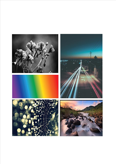
when taking photography for my final magazine i wish to use an effect of the following. Here we have a selection of black and white all the way down to the effects that lay within the camera. these types of effect clearly make a picture better in quality and therefore the image its self becomes more effective and attractive. i would like to use this type of recognition onto more re make models in the future. in the last re make model i did use the effect of black and white on my star Erika. (http://snoweasmedia.blogspot.co.uk/2015/12/photography.html) i also used the element of lighting from various locations such as a lamp, the lights from the class room and also a lighting from the vending machine. although in my next re make model task i will try and use different effects used to allow the image to be even more attractive because this will make the magazine front cover more effective because it will draw audiences in to see who this cover star is. i would like to use these effects in my photo shoots but if they do not work with my image/cover star and background i will not use them because it may look messy and not professional.

Tuesday, 15 December 2015

drafting and planning

Here i am looking further into a layout scheme. from my last remake model creation task i and feedback on how i could improve my magazine front cover(https://www.blogger.com/blogger.g?blogID=104553869073642836#editor/target=post;postID=3772730011728673148;onPublishedMenu=allposts;onClosedMenu=allposts;postNum=4;src=link). I received feedback on how i can improve my magazine front cover. i intend to improve a magazine cover by creating new cover stars and making sure the layout and colour scheme is correct and set out professionally. In this magazine front cover i am looking to replicate a similar idea to get a better understanding and idea of how i could layout my final and future magazine front covers.

i intend next time to have everything that is on this magazine front cover because i want it to look pacts and full of information. I would like my next magazine front cover to include a masthead which is behind or in front of the cover star, a main cover line which is able and easy to see for the audience, cover lines and a pug of puff. with all of these elements i will create a magazine front cover with an appropriate layout. i have looked at this celebrity called Lily fallen and the layout of this magazine front cover because it looks effective and efficient therefore i wish to replicate this layout for my next magazine re make model.


Monday, 14 December 2015

drafting and planning

Here I have looked into the research of  the style and fashion of famous celebrities that are recognised around the world. i would like to replicate some of these styles into further photo shoots I create and also the final magazine front cover.

Adele is known for her British music world wide and is an icon to many young children. Her style and look are very important to me because she takes pride in what she wears. I like how she has this black dress on with the colour as it is professional and eye catching.  The black dress compliments her make up as the eye-liner she has used allows here eyes to stand out and therefore the use of eye contact and direct address presented is clearly shown.

Selena Gomez is also a massive artist in the UK and is also noticed and recognised around the world therefore she also takes pride and care into what she looks like and wears. I really like what she is wearing in this photo because she looks relaxed and calm and it makes us want to feel the same. I like the jumper she is wearing as it is fashionable and is eye catching to the audience. The leggings she is wearing is also looking very stylish and goes with the whole out fit the black stripes on the jumper match with the stripes on her leg which yet again draws us in because it is matching and therefore attractive and stylish. 

Ariana Grande is wearing a white dress in this picture which is extremely effective because it suggests she doesn't need a lot of items to be placed on her and she doesn't always need to be sparkly because she is a well known artist and is recognised around the world by her looks and music. I would like to use this type of style in future photo shoots because I believe this to be effective and eye catching. I like the use of the black and white effect because it is something different and allows the audience to think why is this in this context? maybe she is going through a dark time. this therefore brings attention and publicity to Ariana. i also like her hair, it looks professional and sexy. the wavy hair brings attention to he an the magazine because she looks so beautiful.

The Avicii picture i particularly like and the style he uses is very effective and eye catching. his look gives off a swag because of hie head phones, hat and jacket. His hat and jacket match which is very effective as it draws our attention as the audience. the look and style he gives off is impressive and if my cover star is a male i would like him to portray the look and idea of this because it is clear it is a pop magazine front cover.


Justin Bieber gives off his own style and look as he sometimes wears baggy tops showing his tattoos. he also gives off this swagger attitude as he looks as if he refuses to look at the photograph. i like this because even though it is clear it is a pop magazine front cover he shoes rebellious behaviour and the audience/ reader can think why does he do this therefore he publicises him self. i like this new black and white theme for Justin as it is effective and also suggests he is having a bad time in his life because no only is he not looking at the photographer the black and white can suggest darkness and mystery. If my cover star is a ale i would like him to portray this image as best as possible but with a twist because it would be effective with my cover lines and mast head.

Edd Sheran is a huge inspiration to thousands of people because of his music and looks, he makes people want to be him. I like the use of the prop in this photograph because he uses his guitar a lot in his music videos therefore it is clearly recognised by his fans. His style in this photograph is very simple and plain but this is not a bad thing, the black t shirt is still making him look cool because it compliments his prop and his hair. I would like to replicate this in future photos i take of potential cover stars because although it is plain and simple the cover lines would allow the main image to stand out.

James bay in this photograph is particularly interesting as he doesn't look like a typical pop artist which is cool because he is something different and that brings attention and draws us in to have a look. I like his hat and dress sense because it is cool and funky. i like how he is looking out into the distance because it looks like something a pop artist would do on a pop magazine front cover.  I would like to replicate this if it fits into my whole magazine front cover theme. i will be looking to replicate and experiment with this look in further photographs.


Saturday, 12 December 2015

drafting and planning

Here I am looking into the layout and photography of Lana del ray. I really like the image on the left because it looks extremely professional and effective, it draws the audiences attention and even though this image has no cover lines or a mast head from a normal magazine it is still a good quality image. the use if direct address is strong and allows the celebrity to create a relationship between her self and the audience. looking at this image on the left I believe I can visually layout all the aspects that are usually on a normal pop magazine. the mast head and story line would be on the top looking smart and straight on and the cover lines would be black and red on the left hand side of the picture. i would also include a pug in the bottom left to attract te audience to buy the magazine. the pug would say along the lines 'win tickets to see Lana del ray live!!' I really like the photography of this image and would like to portray this in my own magazine because i believe it will look extremely effective and attractive.
I also like because i like the layout of the magazine, i like how the masthead and cover lines and also the main cover line is presented. I like how the colour theme of white is presented throughout the magazine. the make-up looks professional and amazing, it grabs the readers eye straight away. I like the photography of this image because it is not a normal medium close up, extreme close up or even a long shot, the image itself is sideways because she is lying down. this also allows the audience to  spot this and therefore this makes the audience curious and wonder why she does it because its so different. I would like to use similar ideas from this Lana del ray magazine because it looks effective and eye catching the use of white symbolises purity and the use of direct address allows us to think we have a relationship with her. i would like to try and use this for my cover star and magazine front cover if it suits my cover star look.

Friday, 11 December 2015

drafting and planning

i like this type of fashion because it looks normal and fashionable. wearing a shirt like this in today's society is very normal. the shirt itself goes well with his tattoos, hair and eyes because they allow each and every one to stand out. the shirt itself is smart and not just funky. the shirt tells us that he is serious about his profession but he can pull off and look cool in a nice looking shirt. the shirt also compliments the cover lines because they are white and allow the readers eye to be drawn towards both he cover lines and the fashion of  Edd. the use of red, blue,white and dark brown are the main co lours in this magazine that stand out they are very attractive and draw in an audience because they are vibrant. i might be considering to so something like this for my magnetize front cover in my final photo shoot because for my pop magazine i would like them to look professional and cool at the same time and Edd Sheran  here shows this.

drafting and planning: peer assessment of remake remodel

For my remake of my billboard magazine front (http://snoweasmedia.blogspot.co.uk/2015/12/front-cover.html) I received feedback from the class about what were the positives improvements  of the front cover.

the following comments were all the positive feedback my class gave back:
  • The colour scheme was effective because it allowed the theme of pop to be presented. the colours red, blue, green and yellow allowed the front cover magazine to be  bright and vibrant, I was also told that the colours were really effective and attractive and if it were a real magazine it would attract and draw people in to look at it.
  • Other comments on positives towards my front magazine remake model was that the photography was excellent. i was told by the class and by my teacher that the photography was very good because the use of direct address was put across strongly and also that the main image was placed center of the magazine.
  • The pug used is very effective because it draws the audiences attention right away to know they can win something for free, they also like the idea that they are going to see a celebrity for free this creates attention and also the audience to be attracted and drawn towards the ,magazine.
the following comments were given for the improvements that i should make to create a better magazine front cover for my remake re model.
  • i do not need the colored box behind the cover lines it looks messy and inst necessary. the cover lines can just be presented on their own, they do not need a colored box behind them. although they understood that i wanted to carry the house colour them throughout but the boxes were not needed.
  • i could have also used said a quote form the star to attract the audience. a qote from the stat would have allowed the magazine front cover to be more appealing and seem it has more gossip.
  • i should also make the image bigger/taller so that the image is behind or in front of the mast head and not just below. this will allow the magazine front cover to be more more realistic and efficient.
  • i also need to make the main cover line closer because they look as on their own and not together this will avoid the audience thinking they are just random words, i will need to make them closer together to make the magazine front cover more effective and constructive.

Tuesday, 8 December 2015

Contents page


this is a double page spread that i have decided to look at and analyse  because i am looking into similar products with double page spread contents pages. i would like to have my magazine contents page similar to this because it is is smart and professional. although my magazine will be based on pop music it doesn't mean i cannot be professional. i want it to look like this because i want it to look cool and modern. i like how the layout of the contents page is set out. i like how the picture is large on the left hand side because it clearly publicizes the celebrity and i love how all the information is on the right hand side because it is not scattered and all the information is only in one place leaving the reading to be easier for the audience.

Sunday, 6 December 2015

Target audience


this is my target audience magazine front cover. i have looked into other artists that i would like ti view because they look similar to the type of age range it presents. this magazine front cover looks as if it looks to fit the age range of teens + because it shows a serious side of Miley but the magazine itself is a pop magazine for teens as her music is aimed at this target audience.

the use of house colors presented will indicate that the age range and target audience is aimed at teens + because the magazine itself produces very mature looking theme. this also has bright colors such as blue, yellow, brown and white. these colors also suggests a child side to the magazine and will  attract the Target audience and allow the magazine to stand out.

Wednesday, 2 December 2015

remake model task

photography: i have made sure that my star model in this picture has is positioned right because I wanted enough room to ensure that the mast head 'Billboard' could fit in. i also asked my cover star to use a strong appeal of direct address this was because i wanted her to connect with the audience and to create a sense of a relationship between herself and the reader, this is because i wanted the audience/ reader to feel involved and to interact with them. the use of direct address in this photograph is very effective as it draws us in to have a closer look at who is the star. my main image star is. i wanted my cover star to be standing up instead of on the floor or on a chair because the long shot allows us to see her full body posture, it suggests she is confident and striking a positive stance. this is because she is stood up straight and is not worried about looking up in pride.

layout: after looking continuously into magazine  (layoutshttp://snoweasmedia.blogspot.co.uk/2015/10/layout-experiment.html) I tried to interpret my own magazine front cover similar to Billboard laid out my magazine like this because i believe it looks cool and modern but also easy for any target audience or age to read. I created two columns on the magazine for the cover lines because i believed it to look full and exploding. I have included a puff in this magazine at the bottom right within the star, this is to interest the reader and if they buy the magazine they can see if the have won tickets to see her in concert. this will allow the audience to think thy have a chance in a life time to win a ticket for free. the main cover line is directly in the middle of the main image and over the cover star because I wanted the audience to know that she is doing well in life and she is winning at life.

main cover line: the main cover line for this magazine was 'killing the game' this in today's society means that she is doing well in life and is achieving all that she wanted. I have chosen this main cover line because it grabs the reader attention straight away therefore it is appealing and interesting which will allow people to focus on my magazine. the writing is in white colour, i have done this because it is clear to see from the background it lays on top of and also the colour suggests peace and a positive vibe. (http://snoweasmedia.blogspot.co.uk/2015/10/research-into-similar-products_22.html) although this link has elements of the colour scheme i took the example of this main cover line into my own magazine.

cover lines: I have added multiple cover lines on both sides of the music magazine so that the magazine looks full of gossip and information. i have added other artists such as Drake, Nathan Skyes, Taylor Swift and also Katy Perry. these other artists will attract the viewers because they are well known in the music business and extremely famous. this will attract people to come and read on because if the star is at the same level she must be good. i have also added in about her love life, rivalry and her new top hits. this will attract many audiences because they will find out new gossip and information about the star.   

puff: the puff in this magazine is used so that the audience can win a chance to see the star in concert. this excites the reader and allows attention to be brought to the magazine because many people will believe they have the winning magazine. the magazine also brings a new excitement because of this as many fans will want this so badly. I did this because it suited the magazine and  needed a puff to excite the  audience to think they will win something.

house colours: the house colours used were red, blue, yellow and white. these colours were used because I wanted a positive magazine that would be attractive and appealing to many audiences and fans of the star. i wanted to use these colours because i have looked into similar pop magazines and they have bright vibrant colours which are attractive because they draw in the target audiences. the colours also allow the main image to stand out and be attractive because the colours also allow the use of direct address to come across strong due to the fact she looks deep into the camera lens which allows her to create a relationship with the audience.


Tuesday, 1 December 2015

Remake Remodel Task - Organisation and Photoshoot

here i have took pictures of my friend, she is what i would like my magazine star to look like. i have took the pictures  in the way i did so that i could fit in a masthead and cover lines. i made sure the use of direct address was used to create a relationship between the star and audience. I like the way she has positioned her self in these photos as she looks like a pop star and looks like she could look professional with props etc in my final magazine front cover. i have also made sure the lighting was perfect so that it makes the main image my friend to stand out, an example of how i have done this is the lighting coming in from right onto her face, many people could say this suggests importance and the left side suggests she is dark and devious. i also like how i have experimented with the black and white effect, i like this because it is different and works well. the image with the two females i experimented with as they look as if they have different personalities such as happy and moody because one looks away from the camera suggesting she is insecure. i would like to use this same type of photography as it is effective and i could imagine this type of look on my front magazine cover.